painting is just another way of keeping a diary
- Pablo Picasso
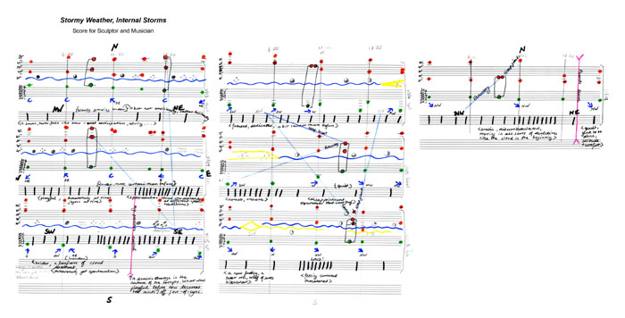 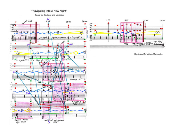 Nathalie Miebach, Sculptural Musical Scores w. pianist Elaine Rombola (www.elainerombola.com) Link: http://nathaliemiebach.com/musical.html creating visual models in order to assist data analysis and interpretation (Leavy, 2009) |  creating art as a part of the representation of data (Leavy 2009) |
Visual art can be used to analyze and interpret data throughout the course of the research process.
Researchers can use visual images and data to find new correlations and meanings that may not have been seen in a purely text form.
Visual art also provides researchers an opportunity to implement reflexive practices in the creation of visual art from their own experiences.
Nathalie Miebach's work is an example of how the visualization of data through new interpretive methods can reflect the specific time and place in which it is created, and develop new meanings through further interpretation.
Sculptural Musical Scores are created from Miebach's translation of meteorological conditions into interpretive musical scores that are performed and visually transformed through her sculpture work.
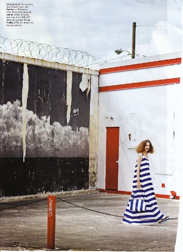 Image: Leblon, Serge, "Everything On the Line". |  |
develop complex meanings through the blending of found text and images.
The process of collage is similar to the scientific research method in that it involves collecting and selecting material, analyzing the interrelation of the materials and themes, and presenting the work as a whole, where multiple interpretations can be made.
In the collage above, the original magazine image is remixed to discuss the larger issues
of abandoned man-made structures and how nature can reclaim these
abandoned spaces by reintroducing native plants and vegetation.
definition
textual collage
a collage rich in text and images that can be viewed as a piece of art
and a method for exploring larger social and political issues
This video was created by The RSA, a UK-based organization that supports innovative speakers and developments in the fields of technology, art, education and community. This clip was created by RSA Animate, a division of The RSA, that visually interprets a lecture from Sir Ken Robinson, a recognized leader and speaker on education in the arts. This recreation is one example of how outside materials and data can be visualized using new methods of analysis and interpretation.
Links & Further Reading :
Going Digital - Using new technologies in visual sociology - Paolo Parmeggiani
Visual Studies, Vol. 24, No. 1, April 2009
An interactive weblog devoted to the visualization of data and creative design.
The work of sculpture artist and artist-researcher Nathalie Miebach.
Source: Information Esthetics
Information Is Beautiful : Ideas, issues, knowledge and data- visualized!
David McCandless is a self-proclaimed data journalist and information designer. An example of his interactive data visualization is the online game, Mountains Out of Molehills : a timeline of global media scare stories
Daily Infographic : A New Infographic Every Day
A daily curated website featuring the best of visual data.
Flowing Data : Data Visualization, Infographics, and Statistics
Maintained by a Ph.D. candidate in statistics, this site features data visualizations including, "How Do I Win Rock, Paper, Scissors Every Time?"
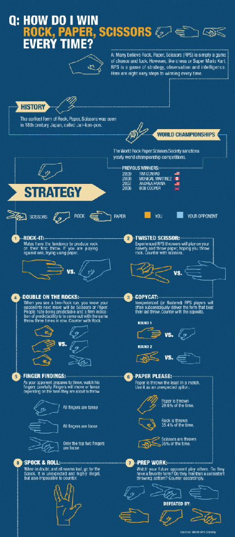
Source: Flowing Data
(http://flowingdata.com/2010/07/30/how-to-win-rock-paper-scissors-every-time/)